
1. Introduction
Excel is more than just rows and columns. For many businesses, it is the first tool they open when they want to check sales, costs, or performance. But raw numbers alone don’t help. What matters is how we analyse the data and use it to make better decisions.
Think of Excel as a map. If you only look at the numbers, it’s like staring at random points. But when you connect those points with charts, summaries, and reports, you see the full picture. That picture can guide you to smarter choices—whether it’s cutting costs, boosting sales, or spotting trends.
👉 Visual idea- Below is Sales data of 4 regions. This data can be easily understood if we show the data in visual for like column chart. You can know in just a second that highest sales are in East region and the lowest sales is from South reason.
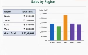
This instantly shows how analysis makes data easier to understand.
2. Understanding Business Data in Excel
Before we jump into formulas and charts, let’s pause and look at the kind of data businesses usually keep in Excel.
- Sales Data: daily or monthly sales, customer orders.
- Finance Data: expenses, profits, budgets.
- Operations Data: stock levels, delivery times.
- Customer Data: feedback, complaints, satisfaction scores.
Each of these tells a story. But if the data is messy—like missing values, wrong entries, or duplicate rows—the story becomes confusing. That’s why the first step in analysis is cleaning the data.
Now look at this messy data in below table –
| Product Name | Sales (₹) | Region | Date Sold | Remarks |
| Item A | 15000 | North | 12/01/26 | good |
| item a | ₹15,000 | north | 12-01-2026 | Duplicate |
| Item B | 8500 | South | 13/01/26 | missing value |
| Item C | N/A | East | 14/01/26 | wrong format |
| Item D | 5200 | West | 15/01/26 | good |
| Item E | 18500 | East | 16/01/26 | extra space |
| Item F | 9700 | Sout | 17/01/26 | typo in region |
| Item G | 22000 | EAST | 18/01/26 | inconsistent case |
As you notice above correctly, see-
In Item A row -every entry is good
In Items a row -all entries are same as item A; it is duplicate and will be removed.
In item B row -“missing value” is written in Remarks which is confusing, because all entries are good.
In Item C row- N/A is wrong format for writing sales. If there is no sales it should be 0.
In Item D row -all entries are good
In Item E row -extra space is there before East
In Item F row- Spelling of South is wrong
In item G row- EAST is in different pattern, all capital letters unlike others.
👉 Now see below, the cleaned data-
| Product Name | Sales (₹) | Region | Date Sold | Remarks |
| Item A | 15000 | North | 12/01/2026 | Valid |
| Item B | 8500 | South | 13/01/2026 | valid |
| Item C | 0 | East | 14/01/2026 | Corrected |
| Item D | 5200 | West | 15/01/2026 | valid |
| Item E | 18500 | East | 16/01/2026 | valid |
| Item F | 9700 | South | 17/01/2026 | valid |
| Item G | 22000 | East | 18/01/2026 | valid |
Now, the above cleaned data is ready for data analysis.
Common mistakes people make in Excel data:
- Mixing text and numbers in the same column.
- Forgetting to remove duplicates.
- Not checking for spelling errors in categories (e.g., “Jan” vs. “January”).
By fixing these issues, you prepare your data for accurate reporting.
To know Railway Station Codes, click here
3. Essential Excel Tools for Data Analysis
Now comes the fun part—using Excel’s built-in tools to turn data into insights. Here are the most useful ones for business reporting:
- PivotTables: These help you summarize large data sets quickly. For example, you can see total sales by region or by product in seconds.
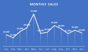
| Month | Total Sales (₹) |
| Jan | 25,000 |
| Feb | 18,500 |
| Mar | 32,000 |
| Apr | 40,000 |
| May | 70,000 |
| Jun | 28,000 |
| Jul | 30,500 |
| Aug | 45,000 |
| Sep | 38,000 |
| Oct | 27,500 |
| Nov | 35,000 |
| Dec | 29,000 |
| Grand Total | 4,18,500 |
- Charts & Graphs: A line chart can show sales growth over time, while a pie chart can show which product brings the most revenue.
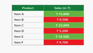
- Conditional Formatting: This highlights important values. For example, you can make all sales below ₹10,000 turn red, so they stand out. See below example-
- Data Validation: This ensures only correct entries go into your sheet (like forcing dates to be in DD/MM/YYYY format).
Perfect — let’s continue your article with the remaining headings 4, 5, 6, and 7, keeping the same simple, human tone and adding examples, tables, and charts were useful.
4. Step-by-Step Guide to Analysing Data
Analysing data in Excel is like cooking: you prepare the ingredients (data), follow steps (formulas/tools), and serve the dish (insights). Here’s a simple process:
Step 1: Clean the Data
- Remove duplicates, fix typos, and standardize formats.
- Example: Change “EAST” and “east” to “East.”
Step 2: Organize the Data
- Put data into clear columns: Product, Sales, Region, Date.
- Example table:
| Product | Sales (₹) | Region | Date Sold |
| Item A | 15,000 | North | 12/01/2026 |
| Item B | 8,500 | South | 13/01/2026 |
| Item C | 22,000 | East | 14/01/2026 |
Step 3: Apply Formulas
- Use SUMIF to total sales by region.
- Example: =SUMIF(C2:C10,”East”,B2:B10) → adds all sales from East.
Step 4: Use Filters and Slicers
- Quickly view sales for one region or one month.
👉 Visual idea: A simple line chart showing sales growth from Jan–Jun.
5. Turning Analysis into Business Decisions
Numbers only matter when they guide action. Here’s how Excel insights become decisions:
- Identify KPIs (Key Performance Indicators): Example: Monthly sales target = ₹30,000.
- Spot Trends: If sales in May are ₹70,000 (highest), you can ask: What did we do differently that month?
- Make Decisions:
- If South region sales are low, invest in marketing there.
- If East region is strong, expand product range there.
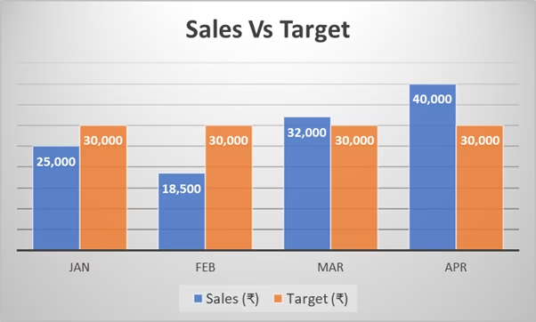
Example Table: Sales vs. Target
| Month | Sales (₹) | Target (₹) | Status |
| Jan | 25,000 | 30,000 | ❌ Below Target |
| Feb | 18,500 | 30,000 | ❌ Below Target |
| Mar | 32,000 | 30,000 | ✅ Achieved |
| Apr | 40,000 | 30,000 | ✅ Achieved |
👉 Visual idea: Here is a bar chart with target line (30,000) across months.
6. Advanced Tips for Analysts
Once you master basics, Excel has powerful tools:
- Power Query: Automates data cleaning. Example: Import sales data from multiple sheets and merge them.
- Power Pivot: Handles large datasets and creates advanced calculations.
- Dashboards: Combine PivotTables, charts, and slicers into one interactive view.
Example Dashboard –
An Excel dashboard helps managers see regional sales, monthly trends, and performance against targets — all in one place.
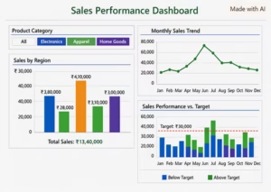
👉 This makes reporting dynamic — managers can click and instantly see filtered insights.
7. Conclusion
Excel is more than a spreadsheet; it’s a decision-making tool. By cleaning data, using formulas, and creating charts, you turn numbers into stories. Those stories guide smarter business moves — whether it’s boosting sales, cutting costs, or spotting opportunities.
Key Takeaway:
- Clean your data.
- Use PivotTables, charts, and conditional formatting.
- Link insights to real business actions.
📌 Call-to-action for readers: “Try analysing your own sales or expense data in Excel today. Start small, build a PivotTable, and see how quickly you can make better business decisions.”
To get help, Visit – www.linkedin.com/in/businessreportingspecialist